Logos That Are Also Optical Illusions
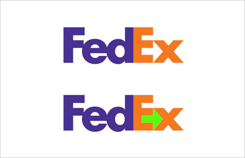
Many organizations incorporate some sort of optical illusion or other deceptive element into the very logos that they build their identity around. For example, did you know that the FedEx logo includes a hidden graphical message? The white space between the E and the X is an arrow pointing to the right. This arrow is very subtle and many people who have seen this logo a hundred times do not recognize it until it is pointed out.
Lindon Leader, the creator of this well-recognized logo, had the following to say in an interview from 2004.
The power of the hidden arrow is simply that it is a “hidden bonus”. It is a positive-reverse optical kind of thing: either you see it or you don’t. Importantly, not “getting the punch line” by not seeing the arrow, does not reduce the impact of the logo’s essential communication.
Another example of an optical illusion effectively used in a logo is from the Pittsburgh Zoo. It uses a figure/ground effect very similar to the Rubin Vase whereby the black tree can also be interpreted in a completely different way. If you look at the white spaces on the left and the right under the canopy of the tree, two distinct figures should be visible. Do you see them?
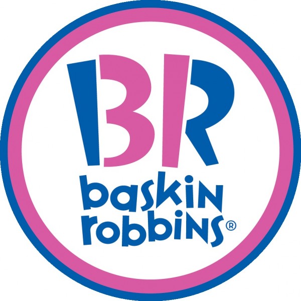
And, finally, the logo of ice cream retailer Baskin-Robins also has a subtle hidden image. The pink portions of the B and the R can also be read as the number 31. Ice cream fans will recognize that Baskin-Robins is synonymous with the 31 different flavors of ice cream that it sells in its stores.
If you know of any other good examples of logos featuring hidden elements or other types of optical illusions, please post them in the comments.







Those were really good and tricky good job!
The face looks like the g in goodwill
I never noticed that before, but you are absolutely right.
http://upload.wikimedia.org/wikipedia/en/thumb/a/a2/Goodwill_Industries_Logo.svg/341px-Goodwill_Industries_Logo.svg.png
Thanks for sharing!
hey i love pizzia
hey… you spelled pizza wrong… I quit eating pizza a long time ago.