Shadow
31 August 2016 0 Comments
I recently came across this unique piece of art created by Anzac Tasker, a graphic designer based in Auckland, New Zealand. I have always found art that uses shadows to be extremely creative and interesting. He started by creating a cutout of half of each of the three letters. He then placed a light at […]
Shadow
29 June 2015 0 Comments
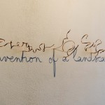
Fred Eerdekens mainly works in three dimensions with the following components – language, material, light, and shadow. In 2014, he created the following piece using bent copper and a light source. The shadow formed by the twisted copper when light is shined on it from the right angle reveals the cursive phrase “Invention of a […]
Shadow
14 May 2015 0 Comments
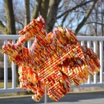
John V. Muntean, the creator of the Magic Angle Sculpture, was recently commissioned by Ogilvy & Mather to create this sculpture using more than 18,000 LEGO® bricks for display in the Singapore LEGO store. The true magic of the model, measuring 50cm x 50cm (nearly 20 x 20 inches), can only be seen when shining a […]
Shadow
22 January 2015 0 Comments
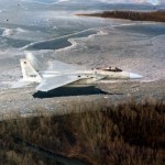
Why is this plane flying so low to the ground? It looks like an extremely dangerous maneuver. The plane is actually flying high above the ground. What appears to be the plane’s “shadow” is a lake far below in the background. This image was provided courtesy of Robert Ausbourne.
Miscellaneous
14 April 2014 0 Comments
This is one of my favorite designs from acclaimed Malaysian t-shirt designer Chow Hon Lam (aka Flying Mouse). I think that I am drawn to it because it is a relatively simple design that also happens to be extremely clever. In many respects, it reminds me of another great design called Light Painter by Tang […]
Shadow
27 January 2014 0 Comments
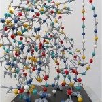
In 2013, Teodosio Sectio Aurea created an enigmatic, DNA type puzzle, consisting of 350 small, metallic balls. The end result appears to be a colorful jumble of balls arranged in an odd formation. But when this design is lit from the correct angle by a light source, a shadow of Leonardo Da Vinci’s famous sketch […]
Shadow
23 August 2013 1 Comment
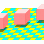
The two illustrations below are nearly identical. The only difference between these two images is the placement of the square shadows beneath each of the cubes. In the upper image, the square shadows are placed just below the cubes making them appear to be hovering slightly above the checkered-pattern surface. In the lower image, two […]

